PROJECT NOIR WEEK 1 - CONCEPT ART
 For this semester I'm going to be creating character concepts of the Scooby Doo Gang from Scooby Doo, Where are you? series in a Noir, 1920's detective, setting. For this project, I plan to create silhouette block-outs, detailed concepts, colour variants, and final turn arounds for each character of the gang and by the end of the semester have a final picture of the character's together.


Character Analysis:
Velma
Trope - Menaced Woman
Daphne
Trope - Femme Fatale / Chante
Shaggy & Scooby
Trope - Clueless
Fred
Trope
Project Plan:

For this semester I'm going to be creating character concepts of the Scooby Doo Gang from Scooby Doo, Where are you? series in a Noir, 1920's detective, setting. For this project, I plan to create silhouette block-outs, detailed concepts, colour variants, and final turn arounds for each character of the gang and by the end of the semester have a final picture of the character's together.
Character Analysis:
VelmaTrope - Menaced Woman
Daphne
Trope - Femme Fatale / Chante
Shaggy & Scooby
Trope - Clueless
Fred
Trope
Project Plan:

PROJECT NOIR WEEK 2 - DAPHNE

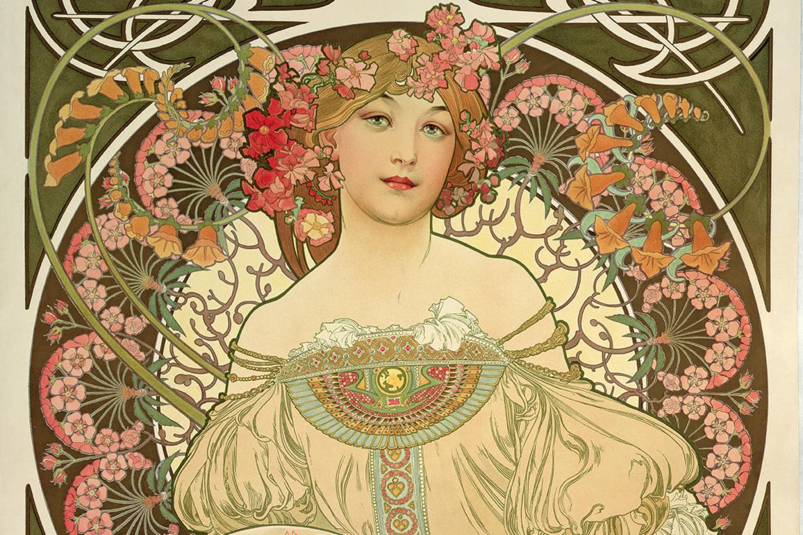
 This week I began by collecting a lot of references for female noir fashion and especially for the arch-type femme fatale which I wanted for Daphne's character. Defined mostly by the strong feminine, hour glass silhouette, I started with more dramatic looks that included longer dresses and shawls or fur accessories. To keep with the familiar character personality of Daphne, I started designing and looking at shorter dress and skirt combinations, adding belts to keep that strong silhouette while playing with hat designs for the dramatic flare.
 From there, I picked six of my favourite silhouettes which both fit the femme fatale shape with the active role that Daphne has in the gang as a whole. Working from there, I cleaned up the rough silhouettes and distinguished the shapes of the silhouette into the strong fashion choices I went with. All cleaned up silhouettes I kept the belted shape to enhance the hourglass figure, along with keeping her curled long hair which also fits the style of film noir. Two of the designs emphasize a more detective-like style with lapel jackets and suit-like designs. From here, I'll take the best three designs and begin the line work and detailing which will then get some colour swatch variations.


This week I began by collecting a lot of references for female noir fashion and especially for the arch-type femme fatale which I wanted for Daphne's character. Defined mostly by the strong feminine, hour glass silhouette, I started with more dramatic looks that included longer dresses and shawls or fur accessories. To keep with the familiar character personality of Daphne, I started designing and looking at shorter dress and skirt combinations, adding belts to keep that strong silhouette while playing with hat designs for the dramatic flare.

From there, I picked six of my favourite silhouettes which both fit the femme fatale shape with the active role that Daphne has in the gang as a whole. Working from there, I cleaned up the rough silhouettes and distinguished the shapes of the silhouette into the strong fashion choices I went with. All cleaned up silhouettes I kept the belted shape to enhance the hourglass figure, along with keeping her curled long hair which also fits the style of film noir. Two of the designs emphasize a more detective-like style with lapel jackets and suit-like designs. From here, I'll take the best three designs and begin the line work and detailing which will then get some colour swatch variations.
PROJECT NOIR WEEK 3 - COLOUR SWATCHING DAPHNE
 Moving on the initial 10 silhouettes, after discussing it with Frank, the two which I proceeded with were the fourth and sixth one from the final six favourites that I cleaned up from last week. Taking those silhouettes, I began to create lineart from the cleared up forms and drew Daphne in both outfits. From there, I used reference from the original 1969 series version of her character to pull a complete colour palette to work from. Since I want to keep her recognizable, and just as many other variations of the show have been made, I kept the limited colour palette already created for her character. Using those colours, I began to test variations of the colours together with the film noir outfits chosen until I had roughly around four to five variations of colour.
 From here, I looked for colour combinations that both worked with the outfit, character, and which would overall look good. Once the colour and outfit are finally chosen for Daphne's character, I can move on to creating either a final render or a character turn around for use in animation or modeling in the future.


 Moving on the initial 10 silhouettes, after discussing it with Frank, the two which I proceeded with were the fourth and sixth one from the final six favourites that I cleaned up from last week. Taking those silhouettes, I began to create lineart from the cleared up forms and drew Daphne in both outfits. From there, I used reference from the original 1969 series version of her character to pull a complete colour palette to work from. Since I want to keep her recognizable, and just as many other variations of the show have been made, I kept the limited colour palette already created for her character. Using those colours, I began to test variations of the colours together with the film noir outfits chosen until I had roughly around four to five variations of colour.


PROJECT NOIR WEEK 4 - VELMA CONCEPTS


 For Velma's design, I wanted to have a strong film noir detective aesthetic inspire her, playing into her genius role. Taking a lot of inspiration from Miss Fisher's Murder Mystery series, wanting to experiment with a more masculine style. As pants for women became more popular, I decided to try several variations of Velma's design with pants and breeches for women to give her a stronger design and distinguish her more from Daphne. With additional inspiration from the 2001 Mummy movie, I also chose to do a handful of designs with a longer khaki skirt that is reminiscent of Evie O'Connell.
 From there, just as I did with Daphne, I picked my favourite six silhouettes to clean up and then from there took the top two varied silhouettes to the next stage of detailing and colour swatching.
PROJECT NOIR WEEK 5 - VELMA SWATCHING

For this week I took two of the best designs with the most varied silhouettes to lineart stage so that they then could be swatched. Unlike Daphne, who has roughly four or five colours, Velma has a distinct red and orange palette which I wanted to stick to and which limited the choices to move to swatching. The only downside to this limited palette is that I've faced my first real challenge in that I don't have many options for swatching Velma's outfits. In most other iterations of this sort of challenge, most people seem to add patterning to her outfit, red plaid to her skirt or bottoms, or they add black to her attire. I'm unsure of either choice simply because of the time period I've chosen.
PROJECT NOIR WEEK 6 - FRED CONCEPTS
After consulting Frank about the colour swatching for Velma last week, I took his advice into consideration for another swatch where I added black to her attire; this broke up the red of her boots and pants or skirt, which I initially was considering previously.


Moving on from there, I went ahead and began compiling references for Fred. Initially, I was considering his design to be more the iconic film noir detective aesthetic with the large popped collar, lapel jacket and fedora. Fred's character has always been defined as the muscle of the group, much more the brawn than the brains, but in some more recent adaptations, he is known for his low of trapping criminals and devising the plans for capture. After receiving some feedback from the class and Frank, I also drew up some concepts for a more business-like or Gatsby type character, which didn't allow for many variations in silhouette since the common 20s and 30s attire for men is just variations of suits with long, straight trousers. Just like how I was considering with Velma, for Fred I even experimented with some simply patternings on some of the designs to add interest since I know his palette is also very limited.
Surprisingly I enjoyed a lot of the more Gatsby looks, but still really did enjoy the iconic silhouette of a film noir detective jacket.


PROJECT NOIR WEEK 7 - FRED COLOUR SWATCHING
For this week I moved on the cleaned-up forms of two varied silhouettes for Fred, both of which spoke to the two archetypes which were discussed for his character, to a detailed and colour swatching phase. Taking what I had learned from Velma's process of working with a more limited palette, I examined the iconic palette I was going to be working with - white, orange, and blue - and decided to add in both a beige colour, which is popular for the lapel jackets of the time period and black. These colours helped to break up many of the larger shapes which were created by the original palette, and allowed for more variation in his design. I also took the liberty, having used my reference for fabric variation, of adding a simple pattern to the Gatsby-esque design which allowed for more distinction from the other silhouette and variations. Overall, I think these colour swatches came out very distinct and work well for both archtype ideas while also fitting the character and time period established.


After having spent a week trying to figure out how to vary Shaggy's design from Fred, and asking Frank about some help regarding the tricky design, I gathered a few more references for some other proposed ideas for Shaggy. Leaning more into the original narrative which we know his character to be, ie the "stoner / hippy" character, I was motivated to try looking into both nomadic styles or naval styles of the time. Wanting to explore more of the labour class design as well, I played around with some farmer like designs, as well as some formal and casual naval designs. I'm happy that the silhouettes are very unlike Fred's and still relate well to the character as well, which was the initial trouble I was having. Out of the ten designs, I think I prefer both the farmer design and the formal and casual naval outfits above all.

Baring the previous week of critiques and the flow of conversation, I decided to take some time to evaluate the designs I have for the current four members together as a cohesive group before I move on to finishing Shaggy and Scooby. Since my designs for both Freddy and Shaggy are rather hard to choose from, due to the variation and interesting silhouettes, I wanted to test the ones I have currently, or the ones which I am more inclined towards, against Daphne and Velma's designs as well. This caused me to realize that the only finalized design was for Daphne, as neither Velma nor Fred have been solidly picked.


After I put them all together I realised that there was probably more variation betwixt the characters themselves by breaking up the more explorer design for Velma and the detective design for Fred. I believe this gives the gang more cohesion since it establishes the characters archetypes that they fill. As for Shaggy, I feel the suspenders fit more with this variation on the gang than the overalls design.


Having broken up the explorer design and detective design, the gang in these two collections feel a lot less like a detective solving group and more like an archaeological expedition lead by Velma, which doesn't fit the original group.


Finally have been able to really put together the gang in a cohesive design way and testing the two Shaggy concepts against the final group, I moved the two final silhouettes into colour swatching and general line art. Having gone through a lot this past week with moving and internet fluctuations, I struggled more than necessary on Shaggy's face and decided to test whether or not those critiquing my work would move beyond commenting on the faces or my drawing style and notice the designs themselves.


Much like Velma, Shaggy has a maximum of roughly four colours for his entire character which did prove a bit of concern while swatching. This was mildly resolved when I realized that the overalls design with his colour scheme was a weird Mario inspired outfit, or Luigi if I changed the colours, so I believe that the colour swatches for the suspender design is a better choice as both a design with and without colour. From there, I took the colour swatch that I believed was the best candidate and replaced his silhouette to see the final group cohesion, which I believe looks pretty good and very recognizable.
PROJECT NOIR WEEK 11 - REFERENCE GATHERING


PROJECT NOIR WEEK 8 - SHAGGY CONCEPT

While not having spent the entire week working on this project due to the stress of quarantine, coming up with a concept for Shaggy stalled my ability to create silhouettes. Men's fashion betwixt 1920-1930 is hardly as varied as it is for the women, and this creates a hard challenge for me in making sure to distinguish Fred from Shaggy. My original idea for Shaggy was that more clumsy detective, such as Detective Gadget, allowing me to create silhouettes composed of the same elements but in a more dishevelled appearance when compared to Fred, especially for his more affluent design. This idea clashed when Frank suggested Shaggy as more the news reporter or newpaper writer of the group, which leaned much closer to Fred's more affluent design and would need some way to break up the look so that the two still portrayed their personalities and the position they fill in the group. I found a lot of references for both ideas and the possibility for a more labour intensive work design, with the overalls and loose shirts that matched his much more simple, disheveled design. This struggle to decide on a direction to go held me up since I couldnt figure out which to go for and how to keep Shaggy varied from Fred.
PROJECT NOIR WEEK 8 - SHAGGY CONCEPT 2
After having spent a week trying to figure out how to vary Shaggy's design from Fred, and asking Frank about some help regarding the tricky design, I gathered a few more references for some other proposed ideas for Shaggy. Leaning more into the original narrative which we know his character to be, ie the "stoner / hippy" character, I was motivated to try looking into both nomadic styles or naval styles of the time. Wanting to explore more of the labour class design as well, I played around with some farmer like designs, as well as some formal and casual naval designs. I'm happy that the silhouettes are very unlike Fred's and still relate well to the character as well, which was the initial trouble I was having. Out of the ten designs, I think I prefer both the farmer design and the formal and casual naval outfits above all.

PROJECT NOIR WEEK 9 - GROUP COHESION
Baring the previous week of critiques and the flow of conversation, I decided to take some time to evaluate the designs I have for the current four members together as a cohesive group before I move on to finishing Shaggy and Scooby. Since my designs for both Freddy and Shaggy are rather hard to choose from, due to the variation and interesting silhouettes, I wanted to test the ones I have currently, or the ones which I am more inclined towards, against Daphne and Velma's designs as well. This caused me to realize that the only finalized design was for Daphne, as neither Velma nor Fred have been solidly picked.


After I put them all together I realised that there was probably more variation betwixt the characters themselves by breaking up the more explorer design for Velma and the detective design for Fred. I believe this gives the gang more cohesion since it establishes the characters archetypes that they fill. As for Shaggy, I feel the suspenders fit more with this variation on the gang than the overalls design.


Having broken up the explorer design and detective design, the gang in these two collections feel a lot less like a detective solving group and more like an archaeological expedition lead by Velma, which doesn't fit the original group.


These last four were merely an experiment to test whether Velma's simplified design could work with the affluent Fred and if the detective and explorer sets would work together, as well. This is where I feel the overall cohesion of the gang identity is lost as the group doesn't carry the identifiers required to really tell the audience that they are here to solve mysteries.
As a whole, having put these together really helped to solidify which designs I believe I want to move forward with for the final pieces of the gang, and potentially which Shaggy design I am more inclined towards from the original 10.
PROJECT NOIR WEEK 10 - SHAGGY COLOUR SWATCH
Finally have been able to really put together the gang in a cohesive design way and testing the two Shaggy concepts against the final group, I moved the two final silhouettes into colour swatching and general line art. Having gone through a lot this past week with moving and internet fluctuations, I struggled more than necessary on Shaggy's face and decided to test whether or not those critiquing my work would move beyond commenting on the faces or my drawing style and notice the designs themselves.


Much like Velma, Shaggy has a maximum of roughly four colours for his entire character which did prove a bit of concern while swatching. This was mildly resolved when I realized that the overalls design with his colour scheme was a weird Mario inspired outfit, or Luigi if I changed the colours, so I believe that the colour swatches for the suspender design is a better choice as both a design with and without colour. From there, I took the colour swatch that I believed was the best candidate and replaced his silhouette to see the final group cohesion, which I believe looks pretty good and very recognizable.
PROJECT NOIR WEEK 11 - REFERENCE GATHERING

After 1929, the American automobile industry suffered a hard blow due to the economic depression, making the years following very hard on the industry. By giving the cars an aesthetic update, they had hoped to bring new buyers into the market. During the 1930s cars began to take on a smoother shape, a more aerodynamic design, hence offering less wind resistance. The 1930’s cars, in contrast to the style-conscious luxury days of the 1920s — saw a renewed emphasis on the mechanical qualities of cars including things like synchromesh transmissions, automatic chokes, and built-in trunks which would become common by the end of the era. Automobiles changed during the thirties from a traditional four-square styling to a more streamlined car by the end of the era. Some of the most notable cars of the era were the 1930 Cadillac 16, 1930 Cadillac v16 madame x sedan cabriolet, 1930 Buick roadster, and the 1932 Chevrolet confederate ba 4-door sedan.
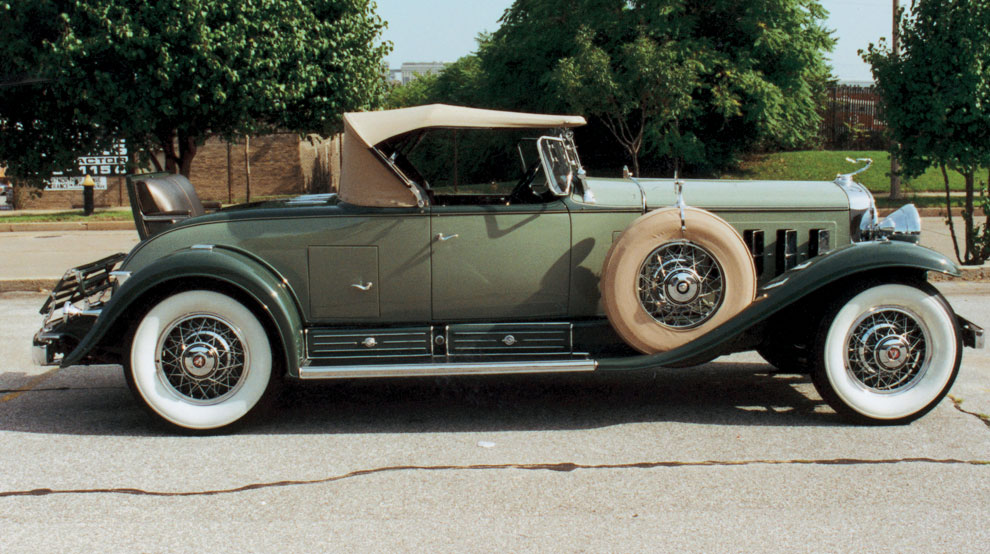
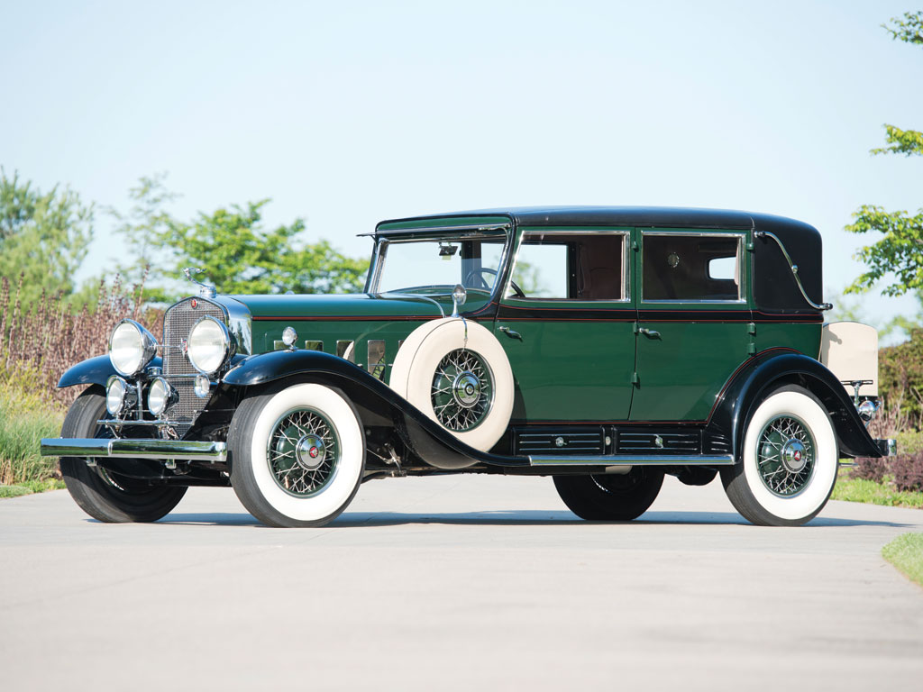
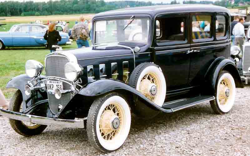
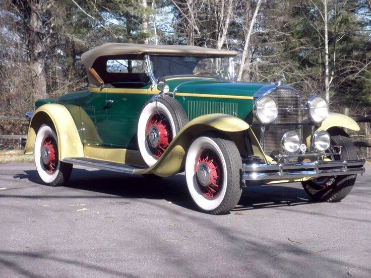
Keeping these sort of models in mind, comparatively the iconic mystery machine is known to be a 1960s panel van with no model indicated via appearance or branding, so I’m left with a little more artistic freedom in the case of the vehicle since most vans of the 1930s, in my research, have come up as working vans with varying silhouettes that don’t give much aesthetic appeal to the gang nor to the era. While not a professional in any sense when it comes to vehicles, stylistically I believe that the most pleasing silhouette comes from many of this era’s sedans and 4 door models, which sport a much more blocky cabin, a long nose, and the iconic swooping shape along with the wheels. I believe that going for a more boxy cabin shape will reflect the more angular shape of the mystery machine itself, especially since many of the automobiles of the time also included the same front tire addition too, albeit on the side. And since the original show is an American cartoon, I figure that would be a great way to limit my choices to just American models.
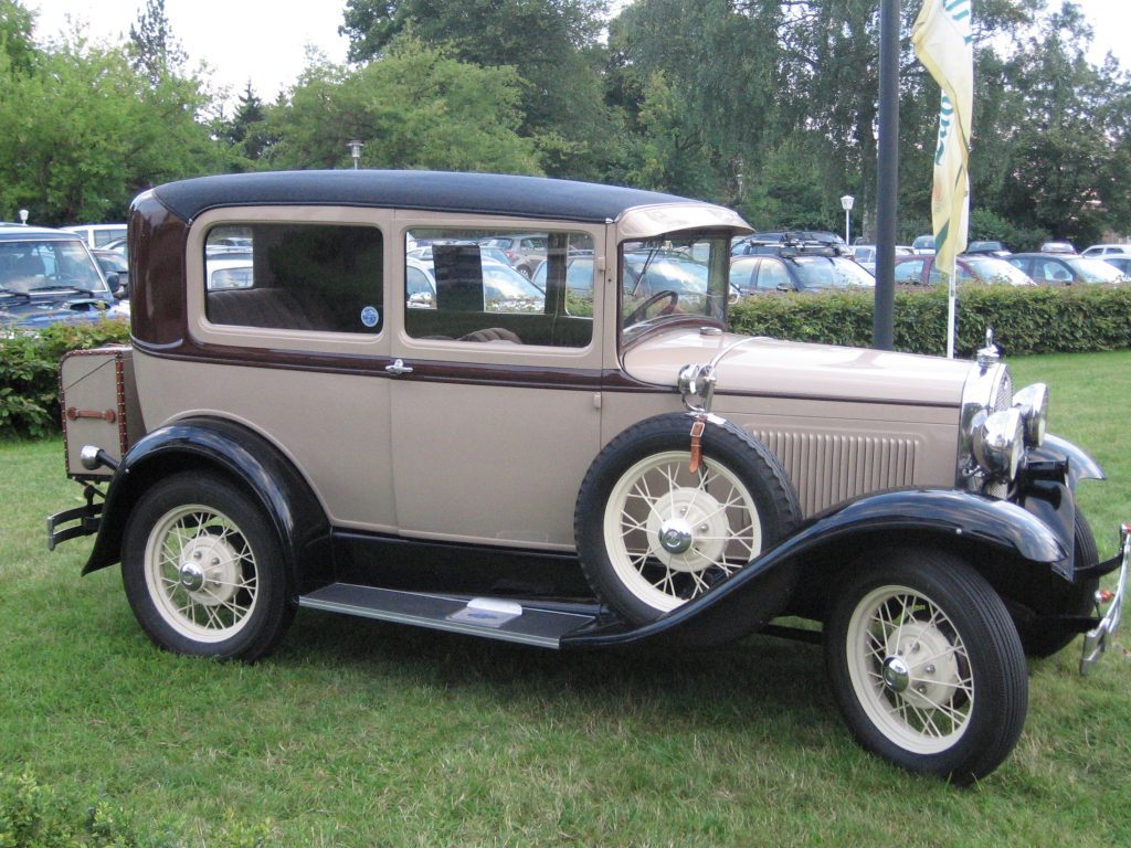
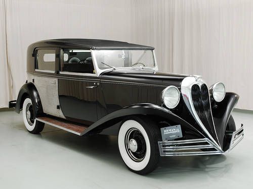
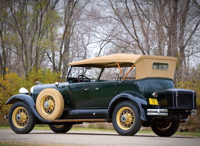
Looking over a lot of the American brands of the time, I definitely find myself drawn to the 1930s Ford Tudor, 1936 Ford Brewster Town Car, and the 1930 Lincoln K Dual Cowl Sport Phaeton, all of which have a more angular design while also embodying the more iconic vehicle silhouettes of the thirties. Regardless of the vehicle design itself, the original palette and paint job of the original van, modified simply to fit the more art nouveau style since it includes natural objects, such as flowers.


PROJECT NOIR WEEK 12 - MOVING INTO FINAL PIECE
Since discovering that the semester is nearing its end, I really wanted to push forward with my work and move into what I wanted to do for the final piece. I know I've mentioned a few times on whether to do contact sheets or something else and it was quite a decision to choose.
My first thought, aside from the contact sheets, was to potentially recreate or create my own variation of a film noir movie poster composed of the gang. I began there and started looking at some movie posters from the time and of the genre, discovering that many of them remain rather focused on a single figure or an environmental scene.


After having gathered a few of my favourite composed posters and even some poses I wanted to reference for compositional pieces, I decided to scrap that idea since I was unsure of whether that would allow me to display the gang's new designs while also keeping close to the nostalgia I wanted to draw from.
From there I went in search of references for what other artists may have done in their own redesigns and how they went about bringing the gang back together. A lot of artists seemed to compose a very simple group shot with all the characters together, which seemed a route I could go whereby I could clean up the initial concepts and push them into a more finalized state. While a good potential final piece, especially since it would mean I could potentially display the altered car design too, I found that to be too much of a safe choice and still wanted to capture a much more iconic group shot that is easily recognizable as the scooby doo gang.
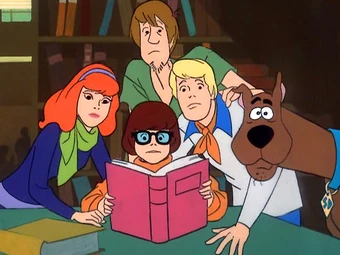
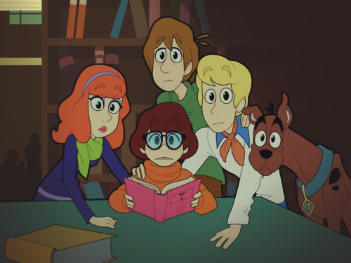
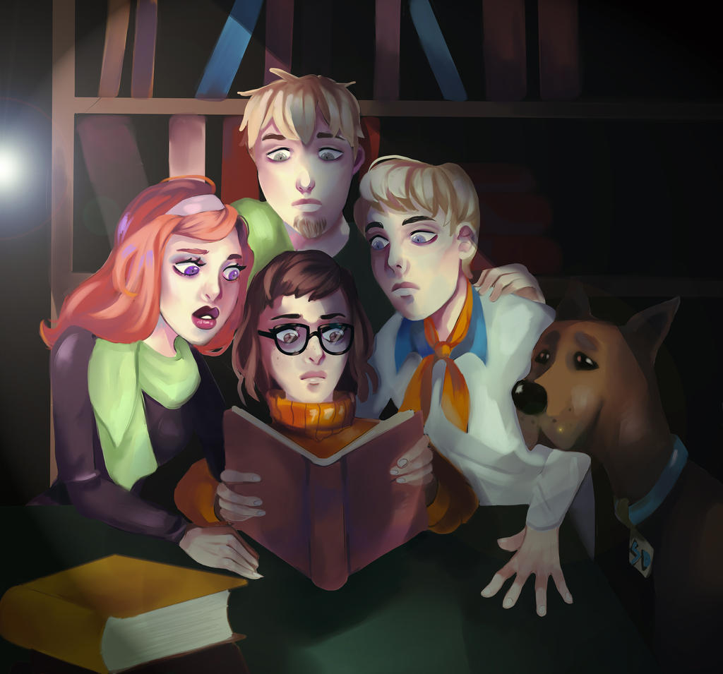
This lead me to the top of my blog and another relatively popular decision: redraw the initial group shot from the scooby doo opening. Its an iconic opening scene which has the whole gang clustered together and really builds the scene for what the show encompasses and I believed that would be a good way to end the project the same way I started this page. With that in mind, I began the initial sketch of the scene, followed by a second sketch layer over to clean up the scene and make it more readable compared to the first quick contour sketch. From here I'll make the decision of whether to remain in my own drawing style or the attempt a more cartoony style, as many comments seem to implicate my drawing style as being "too sharp" or "too intimidating" for the characters.
Once I decide the style, I'll move it to lineart and then begin the process of colouring and lighting!


PROJECT NOIR WEEK 13 - MISSED ECGAS SO NOW WE'RE HERE
Originally I was going to work on the sketch from last week and continue that for my final image, but things have since changed. I actually spent the majority of my time working on what I was considering to enter into the ECGAs, which Frank suggested the lineup picture I had of the gang would suffice if only lacking Scooby as the identifier that would make the piece stronger. So, I decided to add Scooby to the lineup and clean up the original concepts into something a little neater and aesthetically pleasing since I was convinced a piece more rendered out would do better than quick sketches. Unfortunately, this took me longer than I had allotted myself time for as I was considering the previous feedback I had received concerning Scooby's appearance in my designated art style and how to portray him more accurately. In the end, I had managed to clean up the linework, add Scooby, and begin determining the lighting angle, but was not where I wanted to be for submission. Now, since I've invested so much work in the current sketch, I figure it'd be easier for me to just finish the character line up for next weeks presentations. This is also beneficial since it allows me to really showcase the designs I spent the whole semester working on.


PROJECT NOIR FINAL - POST-MORTUM

After a whole semester of working on a film noir redesign of the scooby doo gang, I do believe I was able to achieve the goals I set to accomplish with moderate accuracy. Reflecting on the original plan I had set out to do in the beginning of this entire project, the only things I ended up changing or skipping entirely was varied scooby designs, which albeit is a bit neglectful since he is the main icon of the group. Other than that, I was able to follow the same procedures for each other character in the group starting from silhouettes to final line up, with plenty of reference in betwixt. As a whole project, I am very happy and proud of the final product I was able to come up with regardless of what was missing and learned a lot about the workflow for designing character concepts.
After another semester of working on a portfolio project like this, I've definitely learned that in my personal experience I need to really set hard, specific goals to have accomplished at the end of each week to reduce the amount of bouncing around which I did during this journey. I constantly went back and forth on what to create for the final product which did end up wasting some of my time as I continued to try and decide betwixt a final lineup, render, contact sheets, etc. Another thing I noticed was I would become hung up on unused concepts and ideas, such as Shaggy's design or the Mystery Machine design, which didn't come to fruition. Moving forward, I've learned that for me to really accomplish a final product such as this, I will need to create a much more secure, detail plan of each step of the project so that I spent less time wandering and wasting time that could go into progressing the project forward.
Overall, I really enjoyed the process and am so happy to have ended this semester with something I'm proud to display and something I definitely had a tremendous mount of fun doing.
No comments:
Post a Comment